Genuinus is an online supermarket selling ecologic food in the Barcelona area. Their aim is to sell '0 km. products', respecting both farmers - producers - and the environment itself. They offer quality for healthy consumers who are concerned about well being.
the goal 🎯
Our team had to analyse the current website of the brand (see www.genuinus.com) and make a complete re-design for them improving their features, using the Agile methodology. After 5 iterations in more than 6 months, we got a proposal that improved the User experience of the site, showing a clear, user-friendly interface.
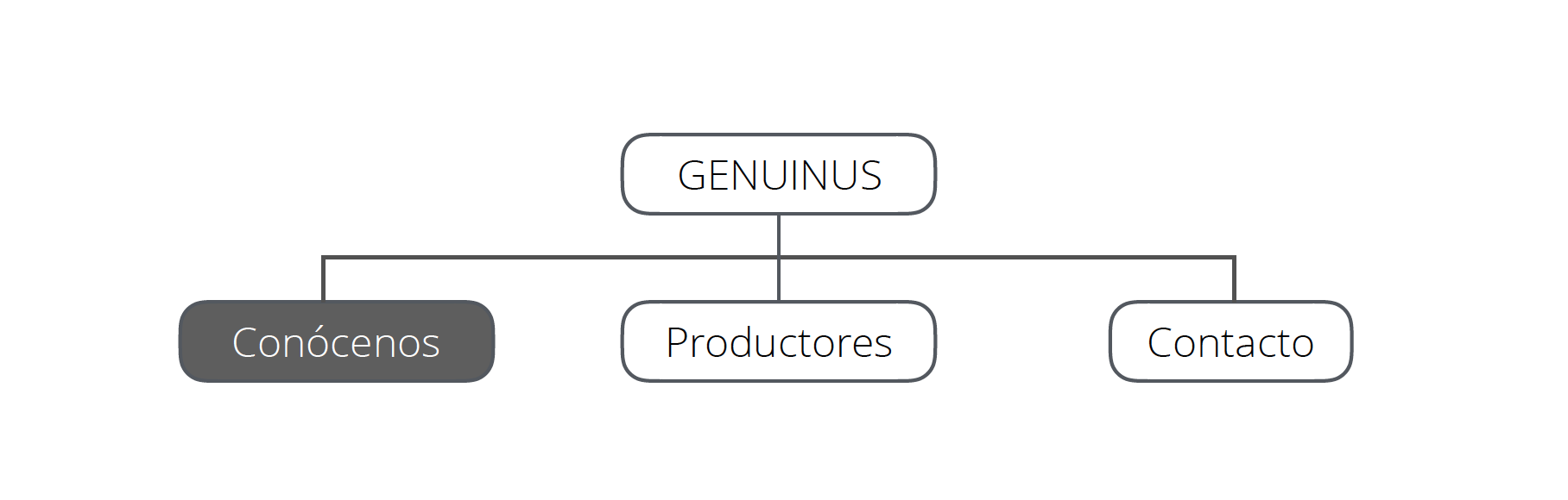
We developed the new web taking into account two points: making the e-commerce easier in the web - they don't have a physical shop, so we had to put extra focus - and giving a higher value to the producers and farmers who are behind each product.
My role in this project included: UX research, UI design, illustration creation, basic HTML&CSS coding and video editing.
crafting the solution 💭
The first iteration of our lives was difficult. We basically studied their whole website and started researching our target with forms and tests. Our main goal was to deliver a full-working MVP in a month, so priorities were marked as:
This was the first structure of our website. We uploaded a PDF in the website so that users could see all Genuinus’ products and a telephone number for them to call and shop from home. Simple but working.
During all the working process we conducted real user tests, starting from the streets, followed by card sorting tests and even visiting and experiencing a UX lab. Our workflow when designing was based in 'mobile first' and every iteration we showed a real working deliverable.
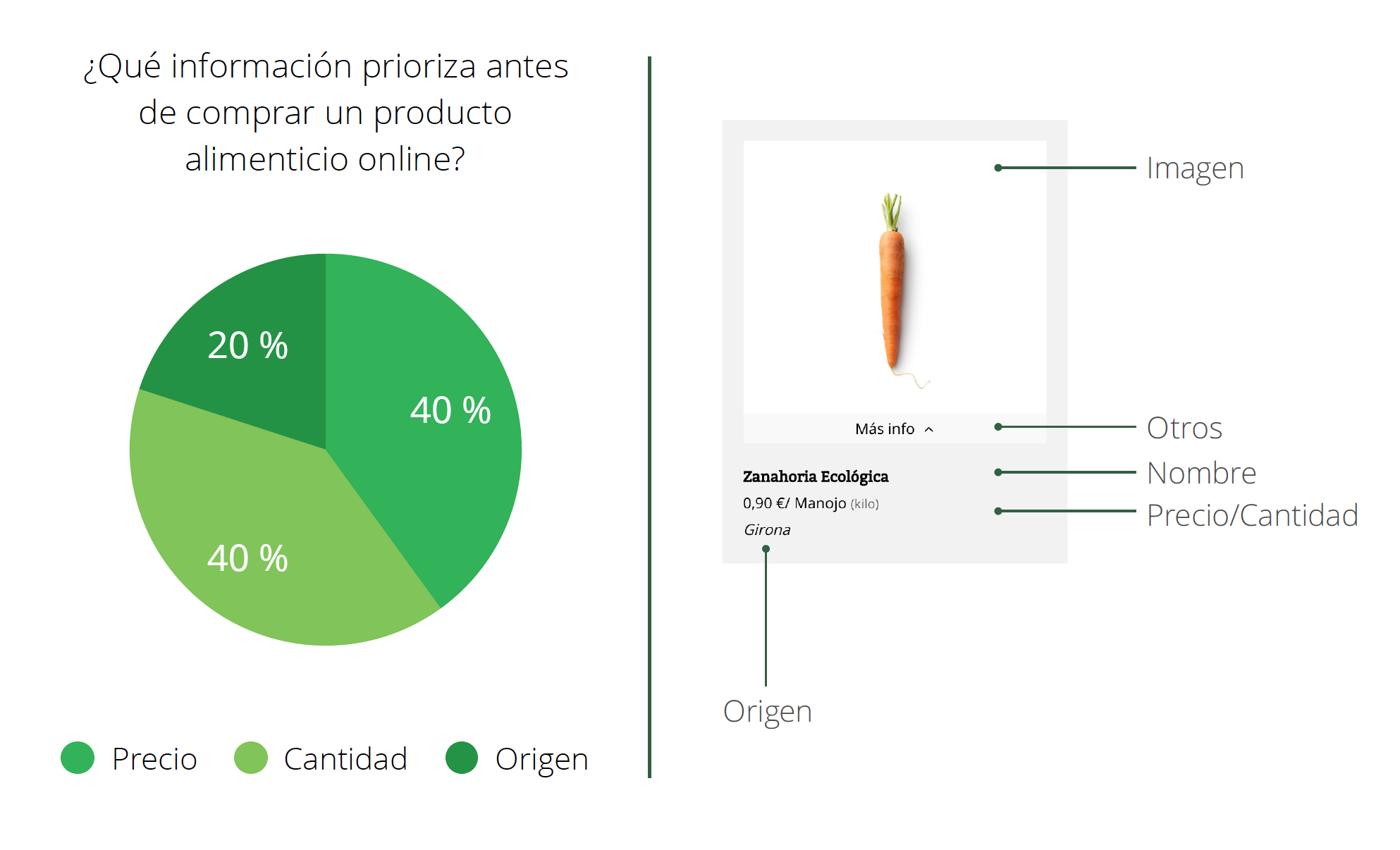
The following releases went faster, so we went adding new features and improving the user experience and interface by testing and validating hypothesis and user stories. All the design decisions were taken based on real user data.
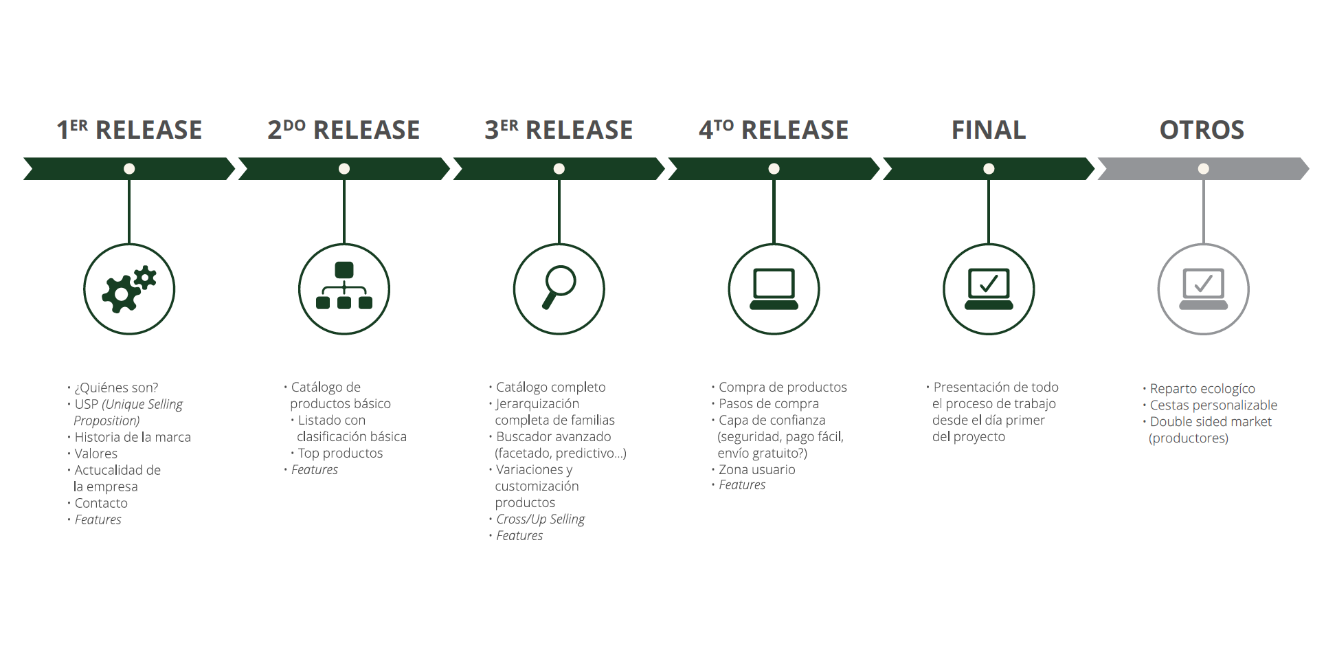
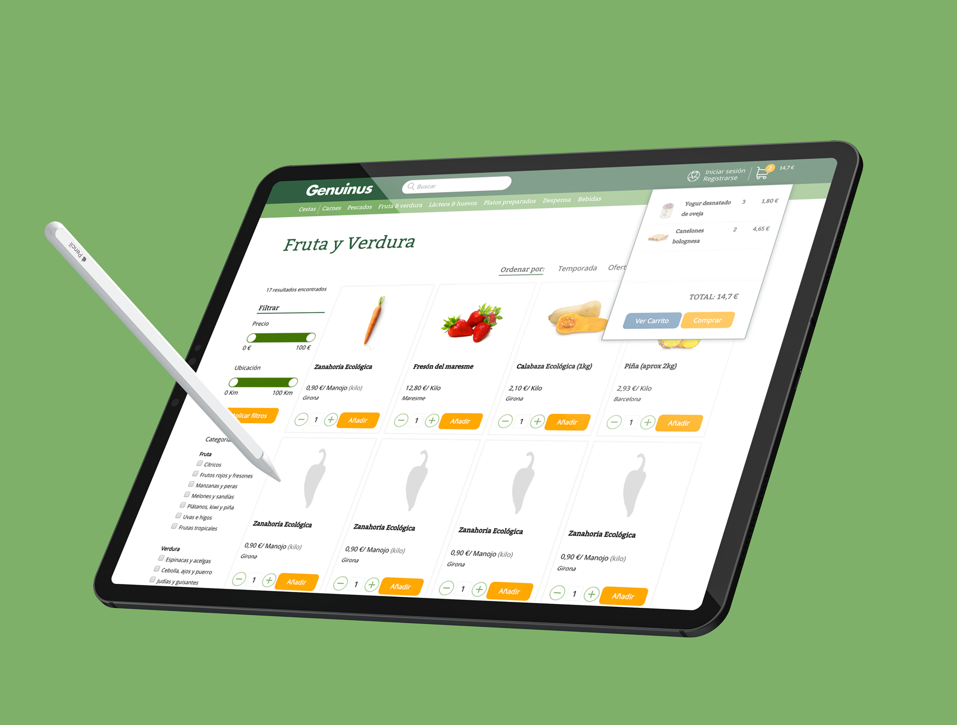
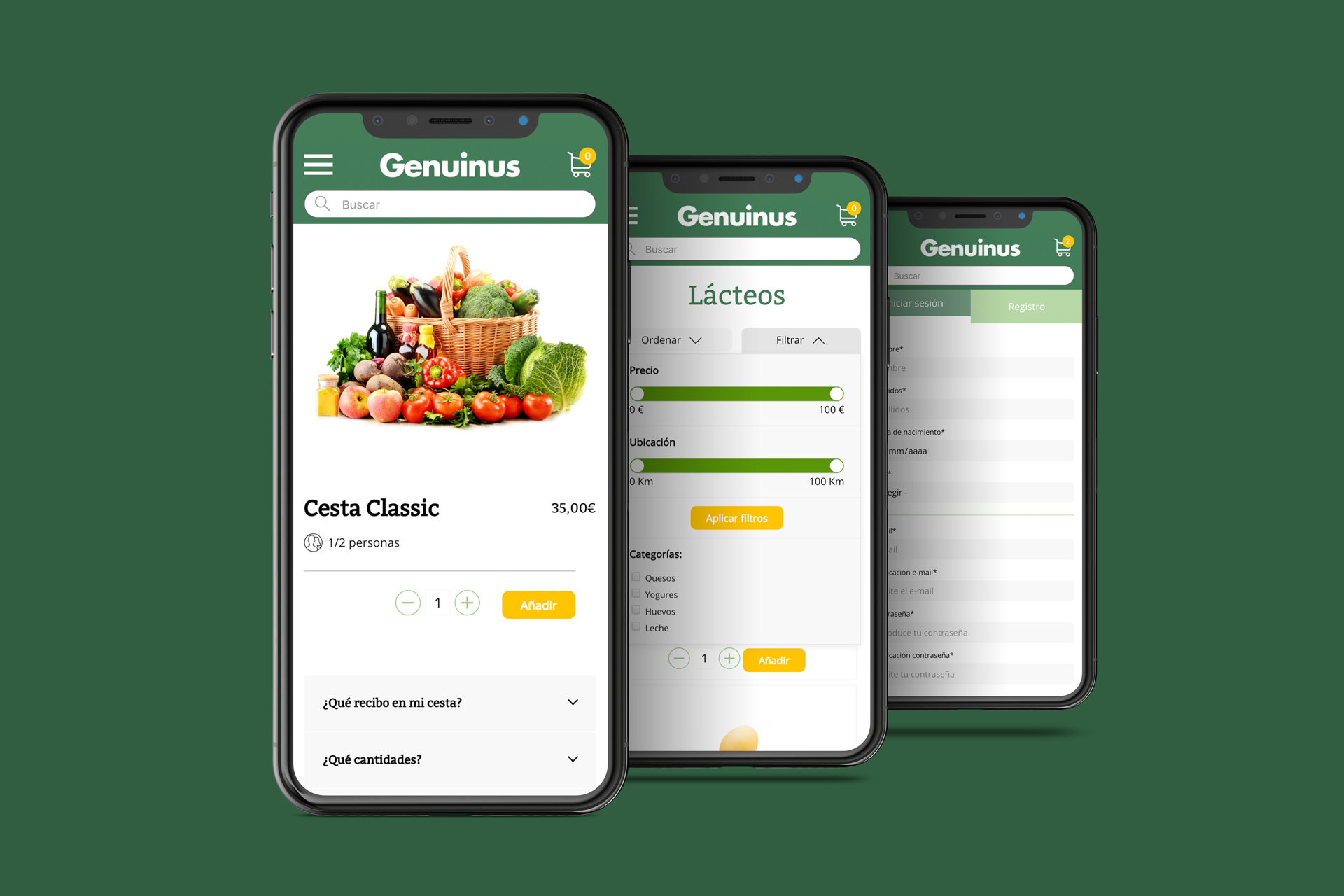
By the 4th release we were finally able to include the whole e-commerce layer. By that time the UI kit was quite big. We developed it applying the principles of Atomic design, so that it was easier for us to ‘complete the puzzle’.
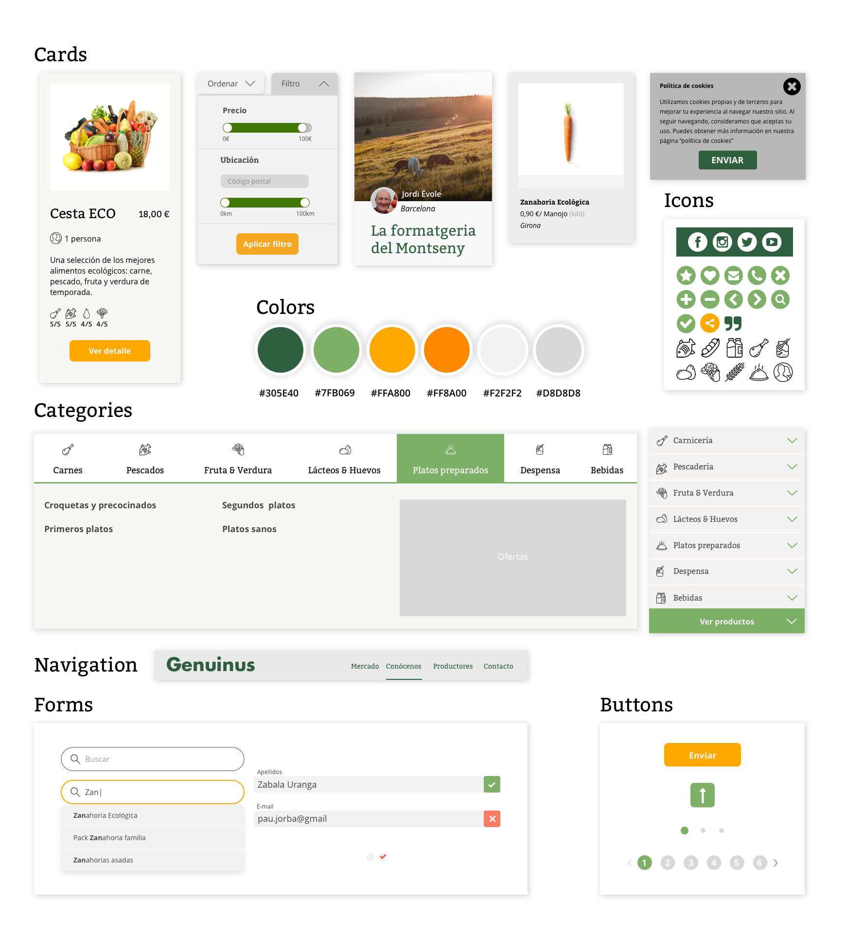
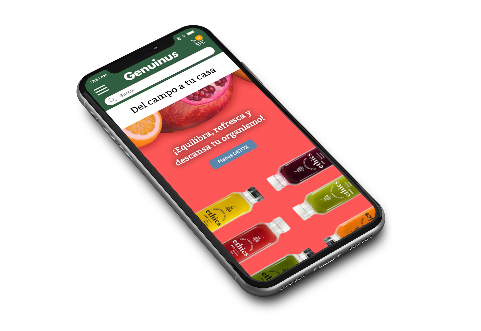
The colors we chose have a natural and Mediterranean reference and the interface design is clear, familiar for the users. A whole bunch of elements such as icons, illustrations and buttons were designed to make reading and using the website easier in every step of the shopping experience.
final result ✨
You can navigate through the live demo in the link above to see the final proposal. We learnt a ton of things during the whole project and the process from the beginning to the end was really fun, thanks to my amazing team!
We even prepared a teaser video for the website re-design explaining the new buying experience:
Hope you enjoyed the project! You can check more below ;)