client
Renfe
year
2019
company/school
Ironhack
Renfe is the national railway company of Spain. They operate thousands of trains everyday and users all over the country navigate their website and app to search for train tickets.
the goal 🎯
For this exercise in an Ironhack event, our aim was to run a quick research of Renfe’s mobile app and finding its pain-points and weaknesses for a given user persona and study case. In only 2 hours we had to run the investigation and make a design proposal in 8 wireframes, everything individually.
We had to explain our solutions and show the navigation and interactions through the Marvel app. The goal of the exercise was to test our ability to run a quick UX research.
My role in this project was the one of a UX designer.
crafting the solution 💭
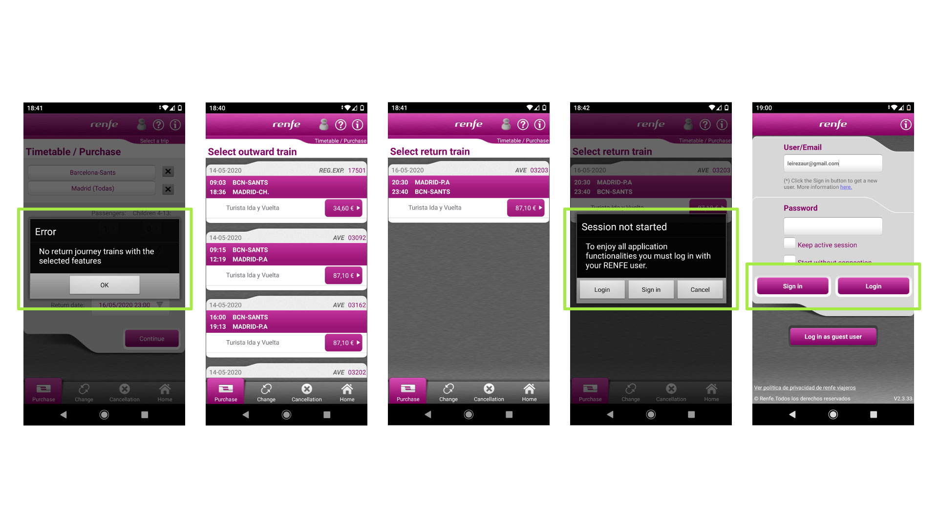
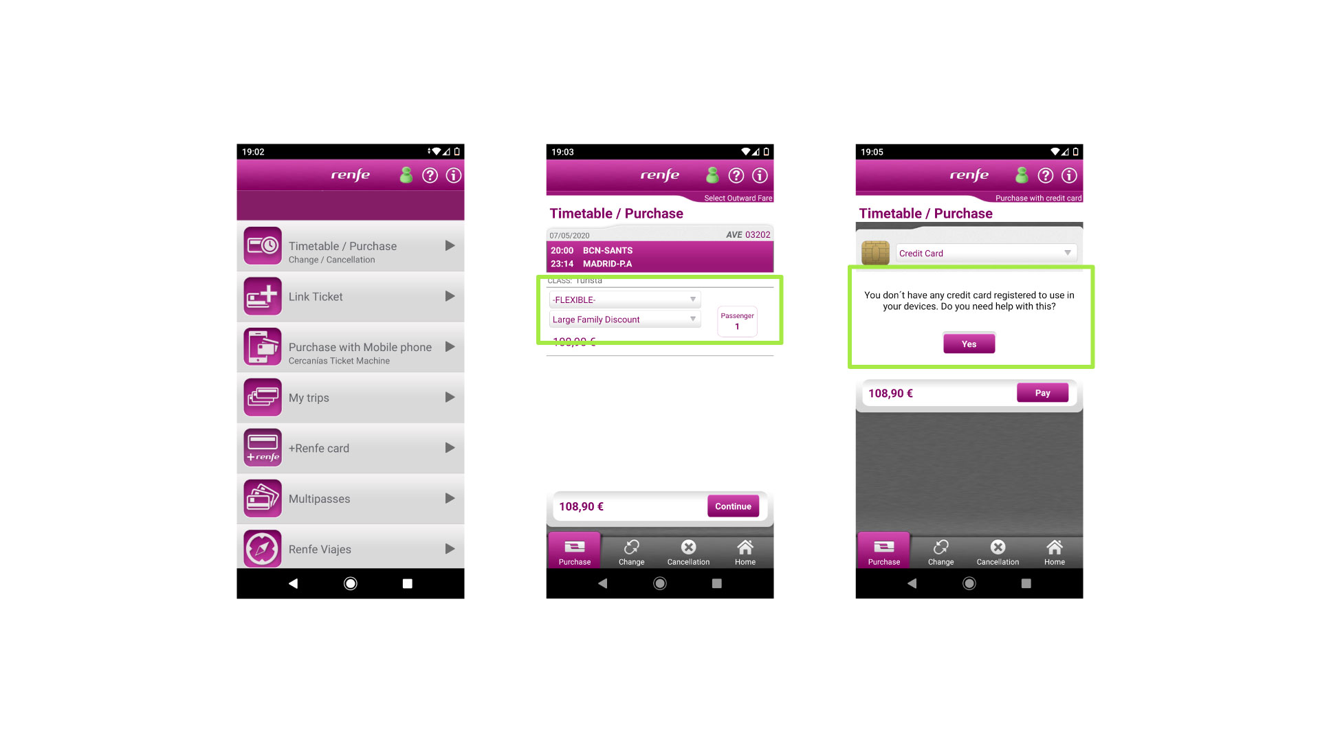
Given this study case, I analyzed the app’s usability through Miriam’s eyes and the pain-points started to appear:
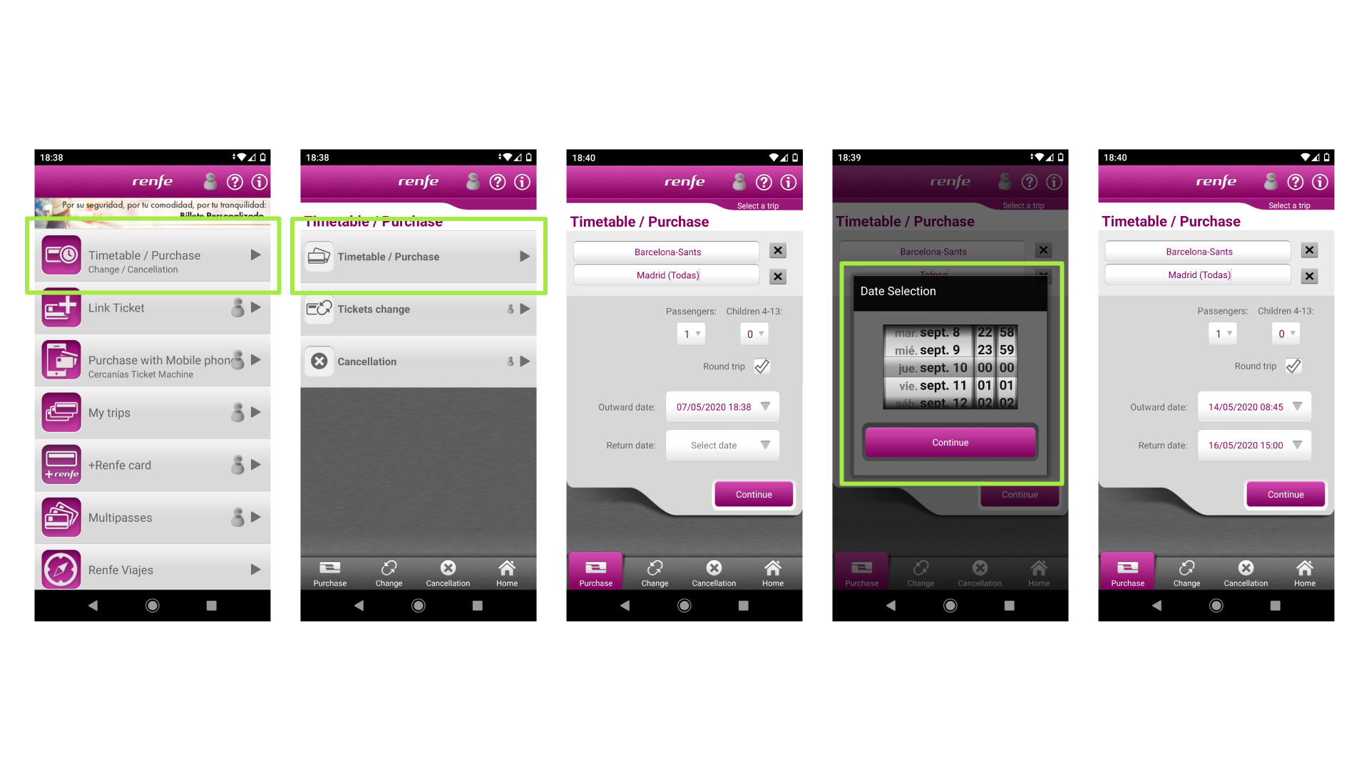
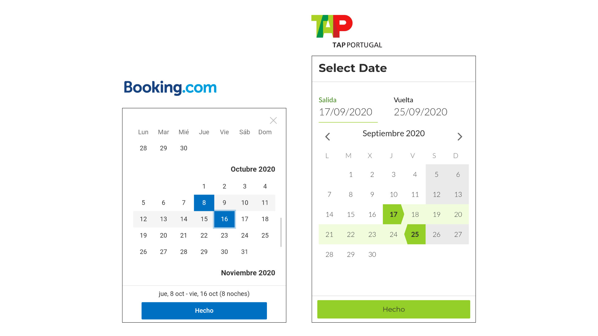
Dealing with these problems, I started drawing some ideas for the wireframes. Looking to successful competitors and remembering other user-friendly booking apps, I took their calendar pickers as a reference for my proposal.
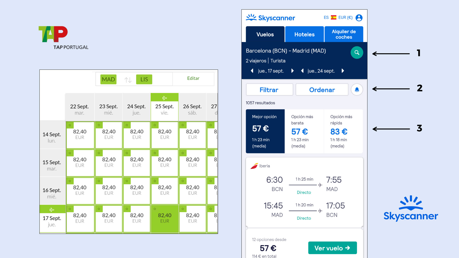
The way results are shown is also important, so I took these examples as a reference, where users can constantly change their searching parameters (1), easily filter them (2) and watch them in different visual hierarchies.
final result ✨
The quick proposal of Marvel (now cleaned with a Sketch layer) shows a clear example of an easy ticket booking for users like Miriam. A purchase with no required login, easy date pickers and visual results’ screen would for sure improve people’s efficiency when planning their holidays and getaways.
Hope you enjoyed the project! You can check more below ;)