client
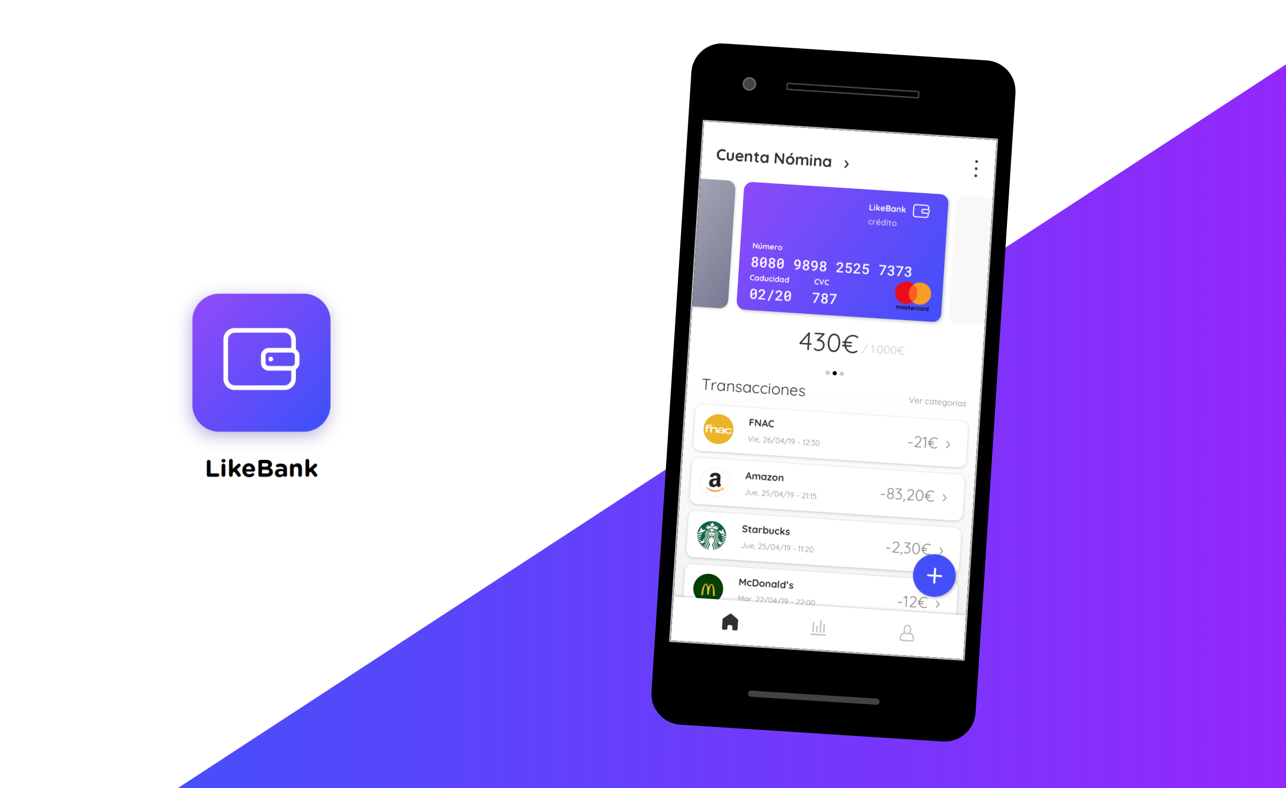
Likebank
year
2019
company/school
None
Likebank is a new online bank for young people, completely online and only mobile: no more offices, no more commissions and no more complex transactions. It is a close bank, actual and creative, and it wants to lead the Fintech sector with a user-friendly interface. A new clean design to break the walls we’ve seen until now.
the goal 🎯
Given this short brief, I had to solve two tasks for a job application.
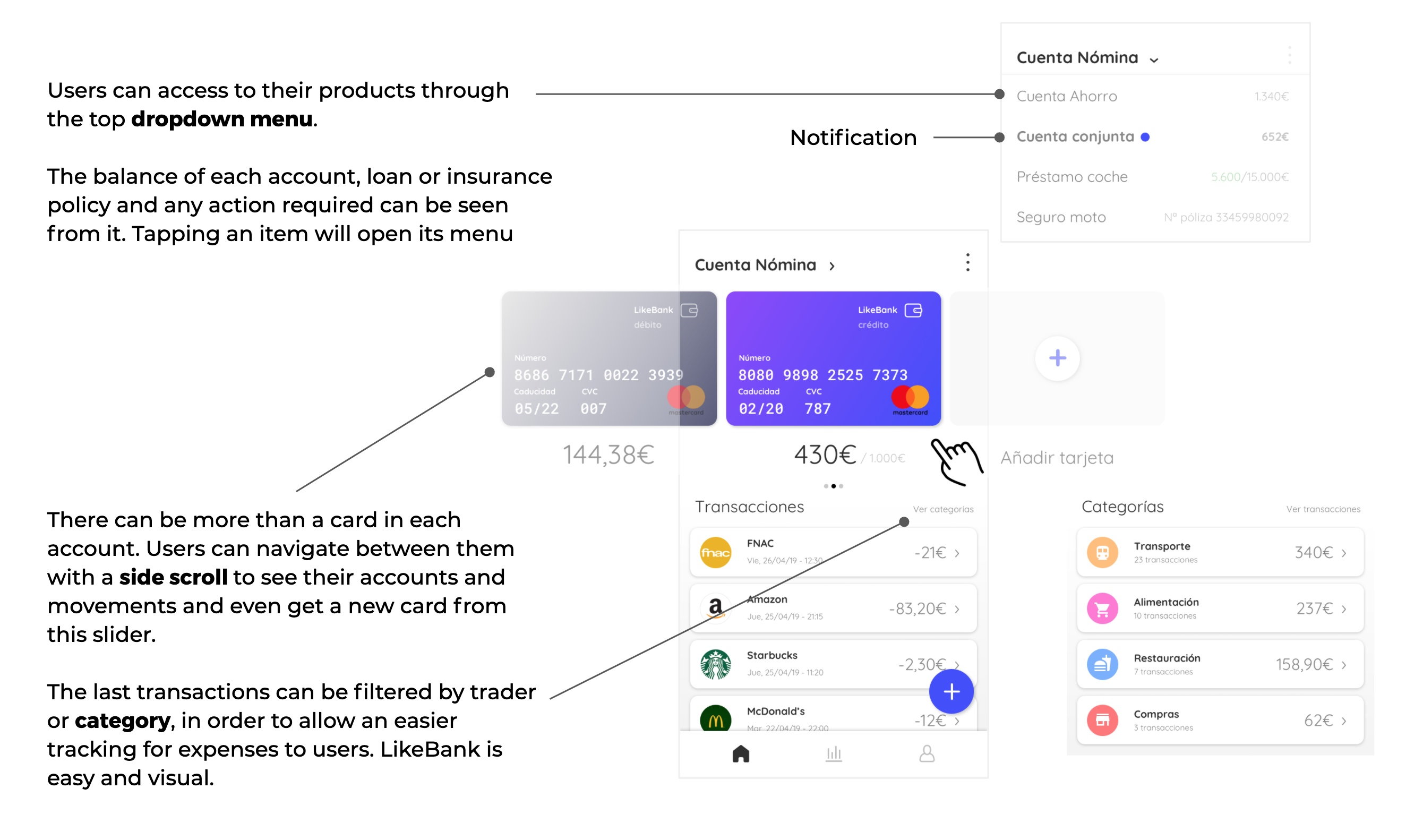
Part 1: Design and argument a creative and user-friendly solution for the main Dashboard of Likebank, for either Android or iOS. These complex banking data should be included:
Part 2: Argument with mobile app wireframes the process of a money transfer to an account number, given this small study case:
'User wants to pay the flat rent: she wants to send the monthly 800€ to the landlord’s bank account. Which screens and UX will Likebank offer?'My role in this project was the one of a UX designer.
crafting the solution 💭
After studying market competitors such as Revolut or Fintonic, I started sketching ideas in wireframes on how to solve the second part of the brief in a short period of time. I wanted Likebank to be a visually simple app, familiar for new users and an app where all the user’s products are shown equally at a glance.
A wireframes study was run in order to draw a proposal to simplify money transfer in an easy and secure way. Users need to access this feature being able to understand each part of the process. That easy navigation is set in the screens below.
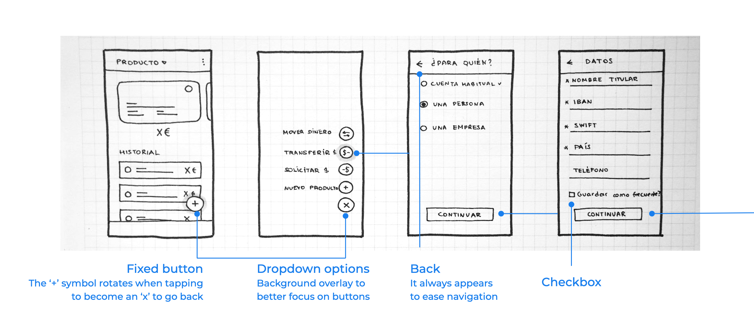
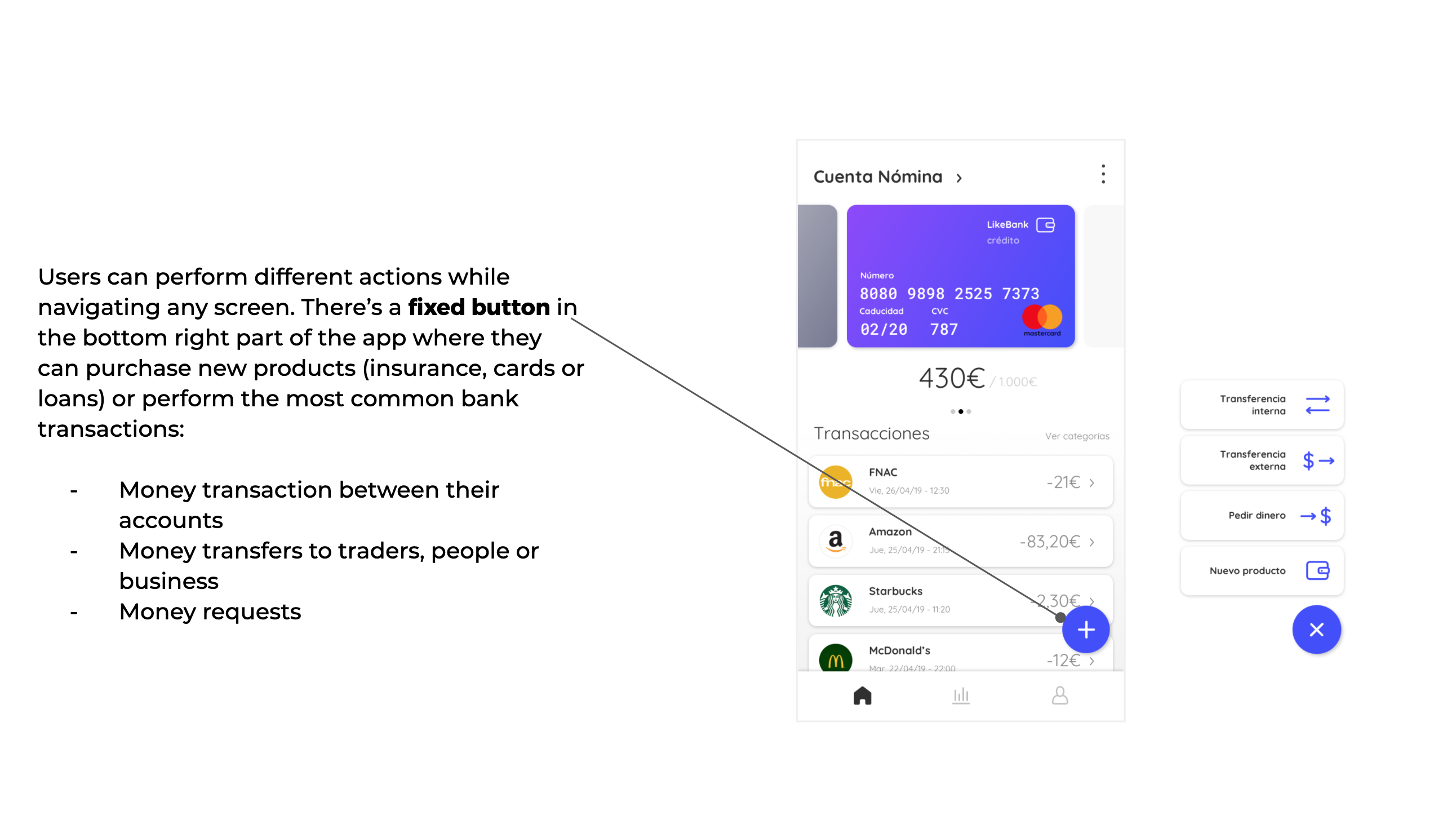
From any screen of the app, the user clicks the fixed button of ‘+’: 4 options with text appear, like ‘money transfer’ followed by a visual icon. Users can tap it and a screen will ask them the destination account first. It will be able to choose between frequent accounts (previously chosen), people or business.
The following screen will ask the user all the information of this destination account: IBAN number, owner’s name and destination country are required fields. One option for saving the data as ‘frequent account’ is also added.
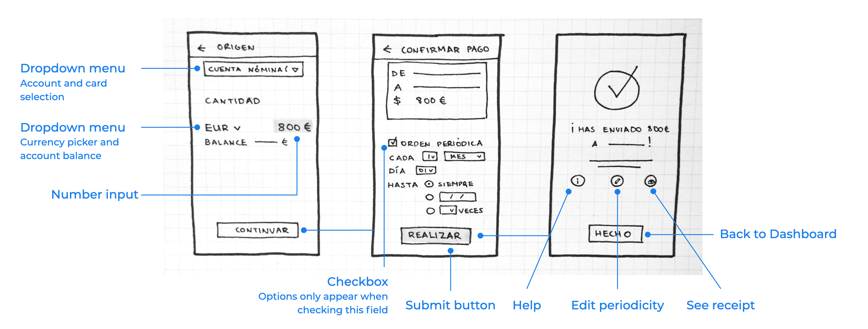
Once it continues, user will be asked the origin information. A dropdown menu will allow her to choose accounts or cards to pay from. When chosen, it will show the available balance and the user will write the amount to send as well as select the currency. Before submitting the transaction, a verification screen will show all the introduced data to double check the action. It also shows the option to repeat the transaction periodically and how to configure its frequency. Once accepted, a confirmation screen will assure the money was sent correctly to destination, as well as allowing users to edit or see further details of the action.
final result ✨
The app's Dashboard was designed thinking in visually common structures for users. All products are treated equally so that it's easier for them to find what they are looking for in the upper part of the app.
Hope you enjoyed the project! You can check more below ;)